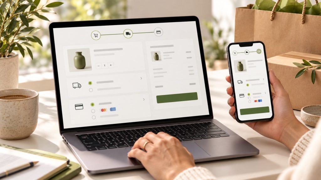
A shopper can like a product, add it to a cart, and still leave before paying. The checkout is where product interest meets shipping costs, payment decisions, address fields, and trust. For U.S. WooCommerce stores, improving this flow means removing uncertainty while keeping the information needed to fulfill an order. This guide offers a practical way to review checkout friction, prioritize changes, and test them without assuming that one design works for every store.
Start with evidence from your own store
Before changing the checkout, review the journey from product page to order confirmation. Use analytics and WooCommerce order data to see where customers leave, which devices they use, and whether a particular payment or shipping method correlates with problems. Look at customer support questions, refund reasons, and failed payment logs too. A high exit rate alone does not prove that checkout is broken; shipping availability, product price, traffic quality, and stock status can all affect completion.
Write down a baseline before making changes: checkout starts, completed orders, payment failures, mobile share, average order value, and support contacts related to shipping or billing. Use a consistent time period and account for promotions or seasonal peaks. Change one major part at a time when practical. That makes it easier to connect an outcome to a specific improvement instead of attributing every movement to the latest redesign.
Make the total cost visible early
Unexpected costs are a common source of hesitation. State shipping thresholds, delivery ranges, and any handling fees on product and cart pages where possible. If shipping depends on destination or package size, explain that clearly and show the available methods before the customer reaches the final step. Do not promise a delivery date that the carrier or fulfillment team cannot reliably meet. Accuracy builds more confidence than an optimistic estimate that later changes.
For U.S. customers, the checkout should handle state and ZIP code details predictably. Configure shipping zones for the areas you serve, test addresses in different states, and confirm that restricted destinations are explained before payment. Sales tax settings depend on business obligations and where the store has a collection requirement; confirm your configuration with a qualified tax professional. A checkout plugin should not be treated as tax advice.
Keep the form focused and easy to complete
Ask only for information needed to process and deliver the order. Remove redundant fields, mark optional fields clearly, and use sensible autocomplete and input types so mobile customers can enter details quickly. If billing and shipping addresses are usually the same for your customers, make that option straightforward. Long forms can be necessary for certain products, but every extra question should have a clear operational reason.
Use labels that remain visible while a customer types, clear validation messages, and helpful instructions near the field that needs attention. Avoid showing a generic “there was an error” message after the shopper reaches the bottom of a long page. Preserve entered information after a recoverable error when possible. Test keyboard-only navigation and screen-reader labels as well as the visual appearance.
Offer payment options with clear expectations
Payment preferences vary by audience and order type. Offer the methods your customers expect and your business can support reliably, and explain when an option redirects to another service. Confirm that payment gateways are configured for the correct currency and that the business name on the payment statement will be recognizable. Display security cues honestly; never add trust badges or payment claims that are not backed by the provider and your actual setup.
Test the complete transaction lifecycle, not only the payment button. Verify successful orders, declined payments, duplicate-click behavior, confirmation pages, order emails, refunds, and the status shown in the WooCommerce dashboard. Use gateway sandbox or test mode for development and follow the payment provider’s process before switching to live transactions. Keep a record of the test scenarios so they can be repeated after major updates.
Design and test for mobile checkout
Many U.S. shoppers browse and purchase on a phone, where small targets and cramped forms create extra effort. Check the checkout at common mobile widths, with the browser keyboard open, and with a slow connection. Buttons should be easy to tap, order totals should remain understandable, and error messages should not disappear off screen. Avoid adding decorative elements that push the main action far below the details customers need to verify.
A one-page checkout is not automatically better than a multi-step flow. The right layout depends on product complexity, required shipping choices, account creation, and the way shoppers use the store. Compare variants with real user testing or a controlled experiment when traffic permits. On smaller sites, a few observed sessions and support conversations may reveal more than a complicated test with too little data.
Reduce account and cart friction
Allowing guest checkout can help first-time shoppers who do not want to create a password before buying. If an account provides meaningful benefits, explain them and offer account creation after the order or through a low-friction option. Make it easy to edit quantities, remove an item, and return to product details without losing the cart. State how saved information will be used and link to a readable privacy policy.
Abandoned-cart email can remind a customer, but it should respect consent rules and customer preferences. Keep reminders useful, identify the products clearly, and avoid implying that an item is reserved unless it really is. Discounts should be tested carefully: a permanent coupon can train customers to wait for a lower price rather than solve the underlying reason they hesitated.
Use a repeatable pre-launch checklist
- Place test orders on a current iPhone and Android-sized viewport, including a keyboard-only pass.
- Test a residential address, a different state, a PO box if supported, and an unavailable shipping zone.
- Verify tax display, shipping rates, order totals, currency, coupons, and inventory behavior.
- Test successful, declined, and interrupted payments in the gateway’s approved test mode.
- Confirm order emails, refund steps, privacy links, and the store’s customer support contact.
- Repeat the critical order path after plugin, theme, gateway, or checkout-layout changes.
Improve checkout in small, measurable steps
Checkout optimization is ongoing operations, not a one-time visual polish. Begin with a specific problem, such as unclear shipping, a mobile form error, or a payment method customers request. Make the smallest change that addresses it, test the entire order flow, and compare the result with your baseline. Keep a rollback path for changes to live revenue flows.
A custom checkout can help when the standard experience cannot support a real business requirement, but custom code adds maintenance responsibility. For a new store, see our overview of WooCommerce development services and our WordPress maintenance plan checklist. If your store content uses a block-based theme, our guide to Gutenberg patterns and custom blocks explains how to choose maintainable building blocks. When you are ready to review your store, contact us with the checkout issue and devices you have observed.
For ongoing order-path and plugin checks after checkout improvements, compare the WordPress maintenance plans.