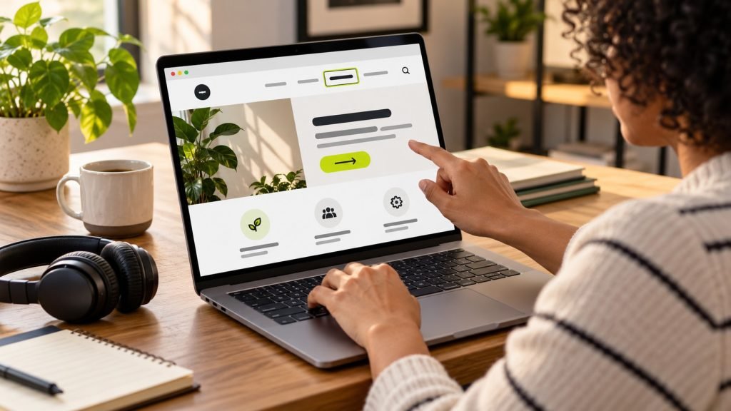
An accessible website is easier for more people to use, including visitors who navigate by keyboard, use assistive technology, zoom text, or browse in a distracting environment. Accessibility also improves everyday usability: clear forms, descriptive links, readable contrast, and predictable navigation help everyone complete tasks. This WordPress accessibility checklist gives U.S. small-business owners a practical place to start. It is an improvement guide, not a legal certification or a substitute for advice from qualified accessibility and legal professionals.
Start with real tasks, not a plugin score
Choose a few important journeys on your site: find a service, request a quote, book an appointment, or complete a purchase. Try them with a keyboard, at enlarged text, and on a phone. Notice whether focus is visible, instructions are understandable, errors are announced and explained, and the page remains usable when content is zoomed. Automated checkers can identify some code problems, but they cannot judge every interaction or whether the content makes sense.
Prioritize the pages that affect customers and business operations. Review the homepage, primary service pages, contact or booking form, and checkout before polishing low-traffic decorative content. Keep a written list of findings with page, issue, impact, and owner. This makes accessibility work a series of manageable improvements instead of a one-time scan followed by an uncertain score.
Check structure, headings, and navigation
Use one clear page title and organize sections with headings in a meaningful order. Heading levels communicate structure to people navigating with assistive technology, so do not choose a heading only because its font looks right. WordPress heading blocks make it straightforward to add this hierarchy. Use descriptive link text that tells a reader what will happen, especially when several links appear together.
Menus should be operable by keyboard, show a visible focus indicator, and make the current location understandable. Test opening and closing mobile navigation without a mouse. Confirm that tab order follows the visual reading order and that visitors can move past repeated navigation to reach the page content. A skip link can help keyboard users avoid tabbing through the same header on every page.
Test keyboard access and focus
Put the mouse aside and press Tab, Shift+Tab, Enter, Space, and the arrow keys where appropriate. You should be able to reach every link, button, menu control, form field, and interactive element in a logical order. The current focus should be visible against the background. A control that appears interactive but cannot be reached or activated from a keyboard blocks some visitors from completing the task.
Look for keyboard traps in dialogs, galleries, navigation overlays, and embedded widgets. When a dialog opens, focus should move in a sensible way; when it closes, focus should return to the control that opened it. If a third-party booking or payment tool is involved, test it separately and contact its provider when you find an issue. Your site is only as usable as the third-party step needed to complete a customer journey.
Make text, color, and links easier to perceive
Use text that remains readable at common zoom levels and avoid placing important copy inside images. Check text and control contrast against their backgrounds, including hover, focus, disabled, and error states. Color should not be the only way information is conveyed: pair a red error state with clear wording or an icon and label. Keep line lengths and paragraph spacing comfortable so readers can track content.
Links should look like links through more than color alone, particularly within body text. Buttons need concise labels that describe the action, such as “Request a project estimate,” rather than a vague “Click here.” Avoid flashing content and unnecessary motion. If a moving effect is decorative, provide a way to reduce or pause it where appropriate and respect the visitor’s reduced-motion preference.
Write useful alternative text for images
Alternative text should describe the purpose of an image in its context. A project image may name the type of site or work shown; a chart may need a concise summary of its key information. Decorative images that add no information should generally have empty alternative text so assistive technology can skip them. Avoid repeating a caption word for word, stuffing keywords, or starting every description with “image of.”
In WordPress, add alternative text in the Media Library or the image block settings. For a linked image, consider what the link does; the text alternative may need to describe the destination rather than the visual details. Review featured images, thumbnails, logos, and images reused in patterns. The goal is equivalent access to useful information, not a mechanically long description for every asset.
Make forms and feedback understandable
Every field needs a clear, programmatically associated label. Place instructions before the person needs them, identify required fields, and explain acceptable formats for dates, phone numbers, and other input. Error messages should state which field needs attention and how to fix it, not merely that something went wrong. Preserve the entered data when a form can be corrected so visitors do not need to start over.
After submission, make success or failure clear in text and ensure focus or screen-reader announcement reaches the message. Test form validation with missing, invalid, and valid information. Check that CAPTCHA alternatives are available and that a contact method exists for people who cannot use the form. On a store, include these checks for coupons, shipping, payment, and order confirmation as well as account creation.
Review media, documents, and mobile behavior
Add captions to videos when speech or meaningful sounds carry information, and provide transcripts when appropriate. Do not autoplay audio. Check that embedded maps, social feeds, and third-party widgets can be navigated and that they do not steal focus. For downloadable PDFs, use accessible document structure or provide the same essential information as web content.
On a phone, verify that content reflows without horizontal scrolling for ordinary reading, controls have usable tap areas, and the mobile menu remains keyboard accessible. Test portrait and landscape orientation where the site’s functionality depends on it. Responsive design helps, but it does not guarantee accessibility; the actual content and interactive controls still need review.
A simple monthly accessibility routine
- Choose one key visitor task and complete it with keyboard-only navigation.
- Review recently added images for useful, context-appropriate alt text.
- Check new pages for heading order, descriptive links, and readable contrast.
- Test forms and checkout after plugin or theme changes.
- Record issues, assign an owner, and confirm fixes on the live page.
- Ask people with different access needs to review important journeys when possible.
Keep improving, and know when to get help
Accessibility is an ongoing quality practice. A redesign, new plugin, marketing embed, or content change can introduce new barriers, so include accessibility checks in publishing and maintenance routines. WordPress core blocks provide useful foundations, but theme styles and extensions can still create contrast, focus, or markup problems. Our Gutenberg pattern guide discusses how to build reusable sections that editors can maintain.
A checklist helps surface common issues but cannot promise compliance with any law or standard. Requirements depend on the organization, services, and applicable rules; seek qualified legal and accessibility guidance for a formal assessment. For practical WordPress improvements, explore our development services and maintenance approach, or request a review of the pages most important to your customers.
Include keyboard, form, and image checks in your regular update workflow; review the WordPress maintenance plans for ongoing site care.